I went ahead and brought over Reaxxion’s layout to ROK for two reasons
1. It’s more compatible on mobile phones and tablets. Less people are browsing ROK from a desktop computer so I want to make sure they have a pleasant reading experience.
2. It increases our ad space inventory. The previous layout was too narrow and did not allow for industry standard ad sizes.
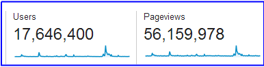
Traffic summary for 2014
For 2015 I will be more aggressive in monetizing ROK so that we can increase our current news offerings. The mainstream media has shown that they are unwilling to provide coverage for news that goes against their narrative, so we will step up to the plate to ensure truthful views get publicized. This means an increase in editorial costs. As a result you will see more advertising on par with larger blogs, including sponsored posts and other promotions.
Passing over daily editor duties to Winston (aka Black Knight) four months ago has allowed me to pursue the boring but necessary backend adjustments that I hope will increase ROK’s long-term influence. I originally started ROK in October of 2012 to be a masculine group blog to compete with sites like The Art Of Manliness and Ask Men, but it has the potential for a much bigger political impact in crushing our enemies.
I believe any system is either growing, stagnating, or dying, and while ROK could happily proceed on its current routine, it’s worth a shot to see what it’s capable of. This will require changes that some of you may not like, but if my vision is accurate, it will be more than worth it in the end. I thank all of our loyal readers, guest contributors, staff writers, and advertisers for making ROK what it is so far. Let’s see what 2015 will bring us.
Read Next: Submit An Article To ROK
I usually hate layout updates, but this actually seems to look better and adds some personality with the medieval theme.
Seriously , that many users? Nice
I like the new layout and it’s even better on a laptop.
Like the new layout.
Of those 17 million user visits, how many are unique? Just curious.
In Google Analytics they just give Users.
Pretty based, Roosh. Keep up the good work.
Congratulations on a great year RoK! I prefer the old layout, but the new one is fine. If you’re looking for ways to increase revenue, I suggest dropping Bitcoin donation buttons on your articles (like this one: http://coinwidget.com/).
meh
Like this design better on mobile, like the old design better on the desktop.
Did you do it in-house?
It’s a customized theme.
I’ve checked both desktop and mobile…both look good.
A new year, a new, good look for 2015.
If your aiming for the big cheese, do what you gotta do Roosh.
My only noticeable gripe with the new layout is that the topics section needs an easier-to-reach sidebar. The drop-down box just doesn’t cut it.
Also bring back a search button. Thanks, otherwise it’s hardly any different.
I like the new layout but am a big fan of search.
Coder is working on those things.
Hey,
Something I’ve always wished this site had was a collection of a few articles for newbies to read.
A “Start Here” of sorts, or maybe a “Best Of 2014,” “Best of 2013,” etc. that can be added to the Topics bar at the top of the website. Something like that.
I think it would be extremely valuable for new visitors to this site and would help to encourage visitor retention by giving new visitors a place to begin so they don’t have feel lost sorting through the huge pile of articles in the archives.
Since the site just launched a new layout and the new year just began, now would be a great time to add this feature!
That’s a good idea. Other sites have such sections and label them sequences, paths, or foundations.
Yeah it would be a good idea.
a separate category for current news, with a kind of stream of daily articles like zero hedge….. and throw articles together quickly as they hit the wire…. and a separate area for editorial and current style content… that will also enable the people that just want to read more enriching articles not to feel they are embroiled in a battle with feminism, which can get awfully boring….
☀☀@t{Google is <-paying 97$ per hour! Work for few hours and have longer with friends & family! On tuesday I got a great new Land Rover Range Rover from having earned $8752 this last four weeks. Its the most-financialy rewarding I’ve had. It sounds unbelievable but you wont forgive yourself if you don’t check it
✒✒✒✒✒✒<
http://ZeecJobs7523.com/Homes2/index…
°°°°°°°°°°°°°°°°°°°°°°°°°°°°°°°°°°°°°°°°°°°°°°°°°°°°°°°°°°°°°°°°°°°°°°°°°°°°°°°°°°°°°
☀☀☀☀☀{{,.Go ON to it and visit proof page—–
got a penny for u dude u better hurry up with that cash in ur paypal for ur drug buying cuz it can get that there froze. do u sell to children?
“4BANS” indeed.
want a penny
I’d like to 2nd this vote, I think this would be really helpful. Also, I’d like to see more articles on bodybuilding (which I’ll be happy to add if you think that’s of interest to the audience).
In response to previous comments you have made, not to mention your article on male birth control, you must have heard us express an interest in your future contribution to the ‘Body’ section at ROK.
I am interested in it; off the top of my head I could name a few others who would also be interested.
Your take on bodybuilding, supplementation and PEDs is refreshing, well informed, and backed by personal experience.
You have already done it Overtaxed, but for others who want to write or read or criticize any particular article–take the challenge: http://www.returnofkings.com/25991/a-self-improvement-challenge-for-rok-readers
Also a a search bar so you can find articles with keywords of your choice.
Yeah I’m trying to get guys at work to fall into the red pill but with random articles they are lost as newbies.
Small suggested change. Put your author bio block between the article and comments. At least on mobile it comes after everything and it’s easy to miss.
Also the Facebook and twitter counts in the author bio would be better at the top of the article someplace since that appears to be what they count.
You have Facebook and twitter share buttons. No Pinterest?
Can’t see all the articles on mobile
Can you email screenshot to [email protected]
Looked a bit closer and all articles are there it just preferences older articles before newer articles. So at the top of the page was “basic math of relationships don’t add up” so i didn’t see some of the new articles till scrolling down.
Top 3 articles are featured. They change every Sunday.
Looks good. A nice update overall. Two things:
1) I second FisherKing about the mobile site – I prefer to see the newest article at the top in the mobile version, not the list of older articles first.
2) I don’t like the ones like “The Fantasy of Women Being Equal To Men” that link you off to some other site.
Otherwise a nice update, which coming from someone who has stopped visiting interesting sites when they updated their layouts simple because the layouts made them unusable, that is saying a lot.
Good job.
As long as it loads about same speed as old site, which seems to.. or maybe even better, I think you justified sound reasoning for the change.
The header could be a little more condensed for less scrolling on PC.
Alright, here are my design criticisms:
1. The huge banner ad at the top, the one which currently features a gif of a girl doing yoga or something, that needs to go. It may be a good source of traffic, but it’s excessively trashy, and highly distracting. It’s also allowing the ad text to be larger and brighter than the site’s logo, which isn’t good.
2. The navigation bar above the navigation bar is confusing and unnecessary. That navigation needs to be moved to the footer, where such information is on nearly all high quality websites out there.
3. The new logo is fantastic, but take the texture off. It’s a website, not a distressed t-shirt.
4. The text in the main navigation bar, and possibly some other text, needs to be switched to a sans serif font.
5. The main navigation bar needs to be organized in a more clear fashion. There must be a better way to lessen the number of categories, or place categories elsewhere.
6. Why is there a grey bar below the navigation?
7. The twitter/RSS/facebook buttons and reaxxion logo need to be changed to match the color scheme of the rest of the site.
Aside from that, its pretty good. If you want to bring me on to fix these things, I’d be glad to talk about it. I already have experience with WordPress.
By following my tips you could go the first image to the second.
“The huge banner ad at the top, the one which currently features a gif of a girl doing yoga or something”
Looks like Minka Kelly, fucking an exercise ball.
That ignorant slut. She told me she was going to change.
I second #1
I agree with all but #1. It’s a great above the fold position for the ad. From a designers perspective I would remove it. From an entrepreneurs perspective I would keep it. Many more variables go into a website operation than just how it looks. The ad really is no bother (think user heat map), the placement will guarantee maximum impressions. More impressions = more money.
I would argue that in the long term, better design will lead to more users, and therefore more money 5 years from now, rather than today.
Q&A section/articles?
Love the new look, missing the search bar.
I like it a lot. Not so busy and much easier to look at.
Where did you take the design for the coat of arms from? Not trying to copy, just am working on creating one of my own at the moment for a separate group. I want to say those creatures are lions but the tongue flame is something more along the lines of a dragon.
It’s called a “Lion Rampant,” found in the heralds of several countries.
https://en.wikipedia.org/wiki/Lion_%28heraldry%29#Lions_rampant
I like the new layout. its cool and simple
cool design but the SEARCH bar is needed
I’ve been a graphic designer for 20 years. My 2 cents: The ROK logo is too small. Perhaps it should be larger and centered. Also, it’s dwarfed by the annoying banner ad on the right. The “Banned from TV” text is larger than the ROK logo. It doesn’t read well.
1. The ROK logo is too small. – First thing I thought about too.
2. Dwarfed by the annoying banner ad on the right. The “Banned from TV” text – It took me about two minutes to realize that it wasn’t my adblock that fucked up. It should either be resized or ROK need to refrain from using “scammy” ads.
Not user friendly
Looks pretty good to me. No complaints. Looks like the same system Reaxxion uses.
I dig it.
Roosh, I gotta be honest with you here. The best way to describe the layout is…clumsy.
There is wasted space here, at least on the full desktop homepage. There are margins on both the left and right side of the page. Fine if you are going to contrast the color of the content with the color of the margins. However, when both the margins and backgrounds are both white, your eyes are at a bit of a loss on where to focus. Coupled with the ads, and it makes for a poor experience. It doesn’t feel like something a person who has never seen ROK would want to read. I’ll contrast with how, and I hate to use it as an example, a website like thefrisky.com, embeds ads both within the sidebar and at the header of the page.
“However, when both the margins and backgrounds are both white, your eyes are at a bit of a loss on where to focus.”
Quoted for truth.
The girl on the yoga ball is sexy and all but I agree with Wolfie it’s trashy and gives the site a cheap almost scammy kinda feel to it. I loved the old site because it had a professional feel and organization to it. The new ROK coat of arms is awesome though.
Are women and gays still prohibited for commenting? Because the ROK guidelines now merely say they are ‘discouraged’… Or is this meant to achieve a bigger audience?
That being said, the website’s new lay-out looks very professional and I hope ROK’s popularity will grow to the extent that the mainstream media won’t be able to ignore its content.
Also curious about this
Even if I hate it, because I was used to the old form, I know that change is necessary for progress. Keep up the good job Roosh
The flashing banner at the top looks bad and it makes the site less serious, which is dangerous since leftists hateshare the articles more when the website looks serious, otherwise the new design looks good.
I never like it when a website I frequent makes a design change. Of course I get used to it eventually. That aside, I think this site could use some artistic direction. Some design choices that unify the page layout a bit more. Go minimal, go extravagant, just go somewhere and stick to it. Also, preferably go in a direction that not only unifies art direction choices, but minimizes the ad content, which is right now too prominent for my taste. I prefer some color, especially if I have to look at big advertisement squares (no issue with ad revenue generation) but give me some page layouts that let me know I’m on ROK with some adverts and not adverts with some ROK content. Of course everyone’s a critic 🙂
Turns out I’m stupid.
New layout is great- much needed improvement for mobile viewing.
1 suggestion: the individual article pages should have the date of the post and authors name under title. Right now u have to go back home to see who and when the article was written by.
All the best to keep growing this truth machine, Roosh. Well done.
Love the new layout. Solid. I’d like to see the dragons back in the logo to give it that regal coat of arms flavor.
Agree and upvoted
CapitalXD
I’m not a huge fan of the new layout, but, it’s not like it’s a big problem, I just thought the old layout looked better. Too much white on this page, I loved to old dark looking site. I haven’t tried it from mobile yet, but the old layout was pretty shitty on my Droid phone, so, if this one is better, I’d say it’s a good trade.
My biggest problem with the site is that new articles don’t automatically appear on top – I have to press reload first, which I sometimes forget. Seems to be a caching issue. So often I will go to the site, see that there are no new articles, and leave.
If you are pushing for more monetization, I’d suggest giving up the automatically generated ad space (which shows lots of crappy & non-targeted ads anyway) and push for more email optins. That way you can (and should) monetize the people on your email list. Don’t wanna get into more details, but there is a boatload of information online about monetizing an email list.
Hi Roosh,
happy new year!
The new layout is good.But the layout is not that important to me.
I started to read this website in 2014 and it has become one of my favourite website
which i read daily.So much wisdom in this website which helped me a lot to understand
and deal with the idiotic female nature.
Just keep on doing excellent work
I don’t particularly care about the layout but the font size is still a little small, especially on 1080p or bigger displays.
I love this site but am annoyed with racist and antisemitic comments. This site should encourage discourse of mens topics with the objective of enlightening and helping all of our brothers. Antisemitism and racial hatred do not benefit the readers. Brothers of all persuasions should feel welcome here and be able post constructive comments without rancor.
I understand what you are saying. But I think the mods do a good job keeping things from getting out of hand. Roosh has done an invaluable service by giving men a place to gather and talk free from the Little Orwells. Freedom like that found at ROK comes at the price of having to listen to opinions that you dislike. I appreciate that Roosh encourages discussion with ROK’s diversity of articles rather than stifle discussion with pieces that are always “on message” and heavy moderation. Masculinity is the only message here, no policing of thoughts.
Much the way he will ban SJW’s and feminists, he should ban the racists and antisemites. Like you say, masculinity should be the message. Men of all races and religions should feel free to comment here. There are plenty of hate sites for nazi’s and bigots out there. No need to pollute the environment here.
Finally a pagecounter at the bottom.
But while the search function was placed bad in the last version, I can’t seem to even find it in this one.
Happy new year Roosh, I like the new layout.
I also enjoyed reading that little Christmas reminder you sent Beejoli! Ha! Ha!
On my ipad won’t zoom in on the articles and comments, so everything ends up very small when I read the articles and comments. I’m not sure if that is by design or accident.
When I come back to a site which I frequently visit and see it all changed, I feel like coming back home and finding all furniture has been rearranged and I can’t find nothing. Then I scream: Wooooman, come ‘ere!
To be honest, I don’t like the new look. It seems desperate. Especially with that huge banner. It’s trashy and way too big, and it makes it through the AdBlock extension. How come? Also the logo with the lions on both side looked trashy, but at least I see the lions are gone.
For a site like RoK the idea layout is as minimal as possible, because it’s a content driven site. When I go to a blog, which from first sight does not reveal much but it has huge number of comments, I know the content is King there.So I stay.
Functionality is good but sometime functionality could be too much, if you know what I mean, because it’s distracting and it makes the site slower.
I understand the site owner wants to make the site commercial but I would gladly donate to keep it simple and content driven. But that’s juts me. Carry on.
Thanks for being honest and forward about the change. It’s less appealing to me but I am still reading from a computer, and I like your reasoning even if I don’t find it as appealing to look at.
The lack of colored borders is a bit off-putting. That was one of the distinctive things about RoK that always felt “warm” and easily recognized and familiar before.
Maybe you can have a compromise between the two. Definitely needs much more color of some type…too much white as it is right now.
Yeah, the old site always reminded me of sitting in an armchair around a fireplace and having a discussion.
Agreed. I understand the need for change but was partial to the dark tones and elegant style of the previous layout. The extensive white space feels like a step backwards. Perhaps there’s a way to implement some of the insightful tips many of the commentators here have suggested while maintaining that fresh new touch?
I do love the heraldic lions rampant logo, though. Very impressive.
Between the ridiculously large banner on top, and the fact that the articles no longer say who’s the author or what’s the date… It’s shite.
It’s alright. May take getting used to.
I read ROK solely on an Android device and I don’t know if anyone else experience this, but when I read the comments at the bottom after several load more comments, it takes longer to load AND the text overlays each other. It responds slower. Also the see more of a single comment won’t work until you hit multiple times.
It gets worse the more comments you load. It gets to the point where I just stop reading any further because it takes forever to load or the text overlays each other so bad that it is illegible.
I’m on an Android (Galaxy S5) I’ve experienced that overlay only once. Other than that I never have issues loading the comments
Way too much white space. I prefer the previous layout
90% of the time, users prefer the prior layout. Lol.
Great new look for ROK to ring in the New Year! Looks great!
I don’t like how 3 older articles are at the top, followed by the newer articles. Please keep the newest ones refreshed at the top
I like the new design. Kinda reminds me of the Shaw Brothers logo from the old kung fu flicks. That logo on a t shirt would be awesome. I would definitely be buying
For 2015 I will be more aggressive in monetizing ROK so that we can increase our current news offerings.
If I notice that the site gets too commercial I will refrain from frequent commenting. The true success of a blog is largely due to the content provided by its visitors and it must not be exploited. I firmly believe that if the site gets commercial the cutting edge of the content will suffer. It was mentioned once that there are going to be paid articles. This might put me off completely. Just look at the current sponsor. It’s a link to one of those dodgy non-interactive videos that usually sell snake oil.
Focus on content, not advertisements/paid articles. If the content suffers, then we have a right to be pissed. Roosh and the authors deserve to monetize the site for all the effort they put in for society’s improvement.
On balance, I think the layout is fine. The sponsored content is a bit trashy, however. On the home page, I’m seeing an annoying and poorly animated gif of a woman’s butt going up and down, and on the right hand bar of another cheap woman flapping her tongue. Compare this with askmen or artofmanliness, and it looks more like a porn redirect than a serious blog. Sorry, but it’s true.
Support your vision and intention Roosh, but I think it will be harder to be taken seriously with sponsors like “Banned from TV”.
New responsive layout is good Roosh. Better ux and logic behind makes sense.
For more comfortable reading would be great to double tap an article and view it full width as can be done with most web text blocks.
Keep up the good work!
As camel jockey pointed out it would be better for the newest articles to be refreshed at the top as it is confusing at first to find the most recent article.
Looks nice, but where’s the search mode?
It seems more neutral to me and less in your face, which might broaden its appeal, but could potentially make it less recognizable. In fact it seems a bit less aggressive / risque, which on balance is probably for the better. Like others not too sure about the amount of white space on display but that can be tweaked
Disqus tends to take a little bit longer to load but it seems pretty good.
looks like shit
I think it’d look better with a background
Change is bad, mmmkay?
Seriously though, the one thing that annoys me is the author’s mark in the upper left corner. It’s all by itself in that column wasting a ton of left margin space. In addition, I much prefer to look for the author’s mark right after I read the story, or alternatively right below the cover picture. Maybe it’s just me, but it seems in odd choice to put it in the top left.
not red enough and prefer scrolling down to changing pages sideways numerically. but who cares what just one reader thinks, use the metrics see what works best, A:B split test and work with that.
the site does look more approachable to non readers now, and i suppose if the content is still hard hitting (jefe, quintus, raywolf, and tuthmosis for the comment-lulz) then its fine by me
Looks good on laptop and phone. Best wishes for a successful 2015!
Layout deficiency to fix: the author’s name is not automatically included anywhere on the article page (unless embedded within the article text) as it did in the footer area of the old layout. Have to click back to the index to find.
It’s on the left column in full desktop view.
If it makes you more $$ I approve. You deserve to be paid for your great work.
Hey Roosh, maybe one you’ll pull your head out of your butt and make t-shirts available with that logo. I would wear it often, and it would even facilitate the community at large… not to mention further monetize your site.
Seriously, get your shit together and make shirts available.
Please.
T-shirts are currently being explored.
Imagine this- the entire manosphere getting all their girlies to pose in the ROK shirts and post them all over the webs… use them as avatars… etc… show up to fem rallies and slut walks wearing ROK shirts… photoshop famous feminists into ROK shirts lol
man I can’t wait
Thanks Roosh. Sorry for the rudeness.
1. Add penises to the lions on the logo, like Sweden’s old logo: http://www.thelocal.se/20071213/9398
2. Fine layout, it looks less original, but eh. Logo’s great though.
Good improvement. I like the organization with author info on the left, article in the middle, and site info on the right column. I also don’t have a problem with the top nav bar, and the site logo’s scale looks good. Somebody suggested a sidebar. Look at yahoo.com’s new sidebar feature. If you could code it, a sidebar that pops up on a rollover would be nice for personalization and links to your other sites. I would like to see your forum incorporated more. Give it a more community feel.
I like it.
Not too bad. But you want Reaxxion to be just as big as ROK obviously so I understand the change.
Put up a button link from Reaxxion to here
It’s good, stick with it.
It’s missing color and it looks too lame/wordpressy. Too much white space that would be better with red space or yellow space.
Going snowblind, missing the red
i usually hate new layouts but i like the site and mobile version!
the only suggestion would be to change the first 3 articles on the mobile version so u get more information about the article instead of just the text and picture!
looks like everyone else’s site. generic!!!
I dislike it. Gaudy and you have to scroll down to find the most recent articles
The new layout sux, and generally PUA advertising drives people away, my opinion when advertising someone else’s PUA method or whatever, make a disclaimer, something like ” I don’t endorse his PUA method or teachings blah blah” otherwise guys will start associating you with scammers.
It’s great having the author’s details on the left, rather than hidden down the bottom. The new logo is also an improvement. But the advertising is now over the top, and the site has a more cluttered look. I visit the site for its content, and that should be clear without distracting images all over the place. If you want a mobile friendly site, build a second design stream on a dedicated mobile site.
Pros:
The site is more sexy than it has ever been.
Cons:
It’s not as accessible as I thought it would be. With the previous layout I was able to see all articles in descending order – newest articles first. People should be able to click on the banner and access all.
This new layout is like the analogy of Westernized vs Eastern European women. This layout is like westernized women, where it is harder to access, harder to understand.
All of us men want something easy to open, easy to access. Lol
You shouldn’t forget that he is a lil neonazi.. I guess he he a gremlin. hes part of the master race that funds sites returnoftheking.com written to be about “politics” but its all tween neonazi pseudo intellectuals. Also they love ddos tinychat for some reason especially women chans.
Other than putting the byline at the top, where it frickin’ belongs, the old version was nicer on a proper computer.
At least the San Francisco colors that appeared for a while are gone.
Nice layout but content is still king.
It looks great for a mobile article-based site. That’s hard to pull off and expensive. However I think a search bar would be a great addition, unless it’s there and I’m missing it, in which case I would suggest making it easier to see and find.
I think the new layout is an improvement. Content is spread out with more white space — easier to digest.
There’s a reason why website redesigns almost always suck, and Roosh has highlighted them here 1) it’s for mobiles and tablets, so you can walk into posts while reading the site on your smartphone and 2) it’s for ad space. I usually cringe and moan when faced with a new layout.
That being said, this is very nice for a redesign. You can find everything easily the first time you use it, and there’s no *giant* *fucking* *pictures* taking up all the space and slowing down the load time.
A site like ROK is meant to be perused on a desktop or laptop, and not skimmed on a smartphone while distracted. But hey, it still works just fine.
Looks OK to me.
Please remove the share this buttons on the left side of the browser. It sits on top of the left side of the page and does not move when scrolling down. I see there are small arrows to reduce it. It only comes up after some time. I don’t want to accidentally hit one of those links on my mobile device.
If I want to share, I can go to one of the buttons already on the beginning of the page. Thanks.
Boys I think the new layout is inferior.
Many are saying that the alterations make it cluttered, confusing, trashy, boring, and cookie-cutter.. and I agree all of that is true and disappointing. But the worst thing for me is that the once classy, sophisticated feel of the place has gone.
I used to log on and feel like I was in a place put together by elite, masculine men. This feeling was brought about by the design. It was simple, effective, concise, and had that classy maroon colour scheme running through. For me that feeling has gone. Now I come here and feel I could be on any other website. We want this place to make new men feel like they’ve found something special, as it did when I first found it.
Never underestimate the power of good design.
I think the “feel” being missed could be easily brought back by returning everything (in terms of fonts, colour schemes, “especially” the maroon box around the logo, the “category tabs” on each article image, and the fonts of the category menu banner) to exactly what it was. You had it perfect as it was in terms of these things.
Very well said. I second the motion.
Please get rid of the pop-ups and phony articles (ie. 15 celebrities who regularly attend church). Not only is it annoying as fuck, but an absolute eye-saw. You don’t need anything detracting from a site’s credibility when the content is already deemed as somewhat controversial. If I clicked on the website today (rather than following your work from the start) I would automatically assume it’s a parody… you know, making fun of the ideas that it’s supposedly championing. Please clean up the site. Hire a decent web-designer (it’s 2015 for crying out loud), and put together something aesthetic. My kid brother could smash something together on squarespace in 15 minutes that would trump your site’s functionality and visual qualities.
I’m not taking the piss. Merely a concerned, long-time reader that sees an idea that might be taken seriously on a larger scale if the people behind the scenes could see that the site is more than a little bit Bush League.
You’re basically asking me “Are my dad jeans fitting me okay?”. Smarten the fuck up dude. Ditch the dad jeans and take a step forward into 2015.
“You don’t need anything detracting from a site’s credibility…” like the 10 million ads only a fuck head would click on?
Yeah mate they get me every time.
I like the new layout, especially the logo.
Sorry missing the old layout, it used to have that virtual men’s cigar club look and feel to it, classy and sophisticated . Come on put that shit back the way it use to be !
I like the new improvement, but I hope that the content grows with the design.
The old one was better.
It had a more royal feel, fuller. It’s the difference between Second Empire Architecture of the mid 19th century and the empty modern architecture.
One has a grand, imperial view. Thrusting it’s red blooded magnificence into the face of all who dare it. The other is, eh. em. whatever.
This style … it’s … nice. Unobtrusive. Tries to stay out of my way.
My recommendation?
Kill It With Fire
You don’t need to make the whole page the same on every device. CSS media queries allow you to auto change the site layout for mobile devices. I don’t like the top of the page on my computer.
Its not as user intuitive and full of useless clutter.
Ads like this is such an eye-sore
Can someone screenshot where the author’s details are? Everyone says it’s at the top left, but I don’t see them
New layout is okay for the most part, but there’s one major downside: there no longer seems to be a Search function enabling you to look up old articles.
Just put your account number up you fool.
New layout looks great! Keep up the good work with your inspiring articles.
The Homepage isn’t being updated past the
What Type Of Guy Gets Falsely Accused of Rape?
article on 4 JAN 15
When reading the enlightening articles on ROK, on my phone, there are two things that bug me with the new layout. 1.: The social media links stick out on the left covering the first few letters of most of the lines text, maybe they could go somewhere else or the content container could have more padding so the social media icons are over the padding instead. Also I cannot easily see the author of the post I’m viewing. I often like to know which author has written the content after having opened it, but have to go back to the homepage to find out. Maybe I’m over looking the name though. Feels like it should be at the very start or end of the article like it used to be.
I like the old layout so much more. Easier on the eyes.