I’m planning to release my new book Free Speech Isn’t Free on June 13. It will be about the efforts to shut down my lectures in Canada last year and the meetup outrage that happened this February. The book is over 200 pages long and includes some bonus transcripts and materials.
The text is complete and all that’s left is deciding on a cover. After doing a design contest, I’ve narrowed it down to three finalists. Here they are:
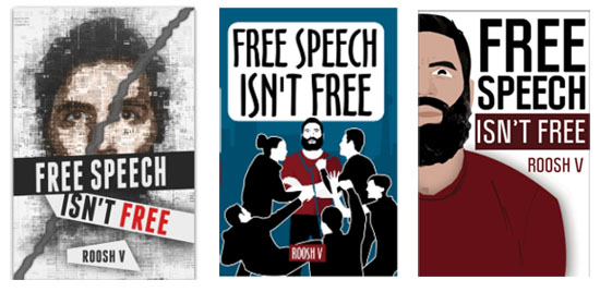
Click here to vote on your favorite. Since all three covers are quite good, I’m inclined to pick the one that gets the most votes. It’s in your hands!
Don’t Miss: Official Timeline To The Worldwide Hysteria Over ROK’s International Meetup Day
Im partial to the first one. Looking forward to reading it.
I do not like the last one, unless you are trying to avoid accusations of white privilege. So I recommend the 2nd one. Looks more fun. First one has a sinister feel to it.
not sure if this makes sense but the first one looks more like a “real” book.
Yeah, the other two have the minimalist design that I might see on a middle school novel. No offense to their respective designers, I know I couldn’t design a cover if I tried, but the first cover definitely looks the best for this subject matter.
The first cover has the highest rating so far, so I guess we can predict that it will be the official cover.
that’s how I felt too. I mean, either that or as if it was done super amateur. Don’t get me wrong, I couldn’t imagine how to makje a straight line in MS Paint, but it is just the sense I get.
Agreed. The first one is by far the best looking out of the three.
I would pick the first one too..
And.. well, this is unrelated but do you guys remember that blonde girl that wears a black turtleneck that was paraded has the super-duper-grrrl-power-woman-CEO and owns a blood-testing company worth “billions”? Well, it seems shit has finally hit the fan:
http://www.forbes.com/sites/matthewherper/2016/06/01/from-4-5-billion-to-nothing-forbes-revises-estimated-net-worth-of-theranos-founder-elizabeth-holmes/#727600c72f29
If I’m not mistaken, RoK did an article about how the whole business was really suspect.. haha that’s funny.
As soon as I saw the description about this fraud in a newspaper article my bullshit detector started to almost melt. Anybody with a functional brain-stem could have seen it was all an elaborate con.
Then this moronic CEO of this con came up with the quote ‘I think that the minute that you have a backup plan, you’ve admitted that you’re not going to succeed.” The arrogance and hubris really irritated me and then it directed me to another quote from a very unlikely source- “Everyone has a plan ‘till they get punched in the mouth.” – Mike Tyson
And the funniest thing is that Forbes was the one responsible for all the hype with the whole ‘look at the strong independent woman conquering the business world’ and all that bullshit. And now watching them admitting their mistake is priceless..
What a dumb b*tch.
ha….nice catch. I forgot about that article. I guess life is like the carousel…..what going around comes around.
She’s the one that said if you have a backup plan, then you plan to fail.
Elizabeth Holmes, CEO of Theranos
LOL what a retarded statement from a retarded CEO…
I suggest taking the Uncle Sam “I WANT YOU” illustration and changing it to FREE SPEECH (isnt free)
You could use the royalty free font “UNITED STATES” for the typography
http://www.dafont.com/united-states.font
Don’t like the second or third ones at all. More options? I mean this isn’t Chicago election is it?
Absolutely the first. Badass.
3rd is worst ill say that
Number 1 is good. I also liked the blank white as it makes a statement.
I’m thinking a drink being poured on your head by a crazy eyed foaming from the mouth Canadian would be a better cover.
I love that first I’m cover off to vote for it
First one with diagonal tear.
I was hoping you had a oic of yourself with duct tape over your mouth and the word triggered written on the tape.
Like this idea also.
Id vote for that.
Second that. Is it too late for a fourth entry?
Or “trigger”.
The center pic reminds me of the press conference you held. Idk why. But I like it. 1st one seems more symbolic, and that’s a better choice I think.
it’s between 1 and 2. 3 looks like something a 14yr old made in computer class.
I like the first one best. Maybe have an image of the First Amendment in the background written in the script like the original Constitution. The SJWs violated the freedom of speech and right of the people peaceably to assemble.
As written in the Bill of Rights.
Amendment I
Congress shall make no law respecting an establishment of religion, or prohibiting the free exercise thereof; or abridging the freedom of speech, or of the press; or the right of the people peaceably to assemble, and to petition the government for a redress of grievances.
Edit: Then again, the attacks occurred in Canada, not USA.
You did a design contest? When? The cover should be a fat feminist with a sword in her heart.
This is the closest I could find
https://ixquick-proxy.com/do/spg/show_picture.pl?l=english_uk&rais=1&oiu=http%3A%2F%2Fwww.horrordvds.com%2Freviews%2Fa-m%2Fdotd04%2Fdotd04_shot10l.jpg&sp=4141ebf440073b38dde63db6cb978d5e
Triggered
Her black, black heart…
First one, definitely.
Roosh,
Let me start off by saying that I will be purchasing this book and devouring every word of it.
Secondly, out of the three choices, I would choose the second one. It best portrays the fat-feminazi-liberals whose aim was to bring you down.
However, it might also be cool to have a blank cover. Just all white, with black bold writing: FREE SPEECH ISN’T FREE. Let your readers give it an image themselves. After all, that is our goal: to give our world a brand new cover design, right?
Whilst I liked the second one for the fact that you had screaming hordes of fanatics attempting to deny you your right to free speech I think the first one is most apt but perhaps with a slight change so that you would have your mouth taped shut with the words: “FREE SPEECH” emblazoned on it
Or could have it like the old Led Zeppelin “In Through the Out Door” album where you have 6 different covers from each person’s viewpoint in a room. Wrap the whole book in a brown paper bag.
first on is vastly superior. i voted.
Also, a suggestion-in order to give this tome a little more gravitas how about signing off on it/having the author’s name appear as – Daryush ‘Roosh V’ Valizadeh or would it be analogous to saying ‘Roosh V’ is like a Nom de plume like Moliere had.
I like the first one, too…
.
Free Speech is HATE Speech !!
The first one looks good. Also this gets released on my birthday.
First one for sure. The other two look gay.
ps. Guys don’t forget to cast your votes in the link.
I prefer the middle one. The first cover is professional, and well done, but it does make the book about Roosh, rather than Roosh’s adventures with SJWs. The choice is between Roosh as hero and Roosh as hero in SJW drama
The first one looks more professional, it also shows your mouth being covered which coincides with what the MSM tried to do e.g. the ROK international meet up. Would like to buy the book to contribute to the ROK movement. How much will you be charging on Amazon? I live in the UK so a conversion to GBP will be appreciated. Keep up the good work. This is the only social platform I know in which whoremongers, marriage-orientated men, black nationalists, white nationalists/alt-righters, libertarians, conservatives, Christians, Athiests etc can actuallys discuss things without being PC.
Release price will be about $7
ROK veteran reader here.
NR. 1 is the ideal.
P.s.
Nr. 2 looks more like a cover for a book that would be called
,,How to be a justice warrior”.
Nr. 3 – ,,How to grow a new-age millenial beard”.
Been reading and posting for a little while now.
Rule out #3. Out of 1 and 2, go with the second one.
One idea though, put some form of weapons in the hands of these sjw figures. Also make one fat, one with purple hair and another into a brony.
Make your opposition look insane and psycho so that even the most dimwitted person can get what’s going on.
First one. Very Descriptive/illustrative.
First one is the best, the other two make Roosh look too much like Dan Bilzerian
Before clicking on the article, in my head I imagined something reminiscent of your attack in Canada which the second would represent. However, the artistry on the first is excellent. Perhaps a depiction of the second done in the style of the first?
Omg a new Roosh book!
My inner screaming fanboy is #triggered!!
My vote is for the 2nd cover. Although I agree that the 1st one from the left looks like a “real” book cover, the 2nd one reminds me of those asshole Canadian SJWs that assaulted you. You should have one of those black shirts on the middle cover pouring a drink on your head.
#1
I like Chip Baskets’ idea. These are OK but don’t ring any bells. Of these, I prefer the one on the right. The image and text are both quicker reads. There’s too much going on in the left and center examples.
Title reminds me of that song from Team America, lol. Also, I vote #1.
I’d put a picture of Muhammad on the cover. Why not ignite the world.
It seems I’m in the minority, but I like the second cover. It shows how “liberal” liberals are when you disagree with them.
#1 looks like you’re being silenced. It’s my favorite.
Roosh, good luck with the new book. I hope it hits the NYT bestseller list. Who knows, maybe all the negative publicity will work in your favor just like the Fatwa they issued against Solaman Rushdie!
I like the first and the second one. Best from me and good luck with the book, Roosh.
I like #1
The first one. The other two make Roosh look fat.