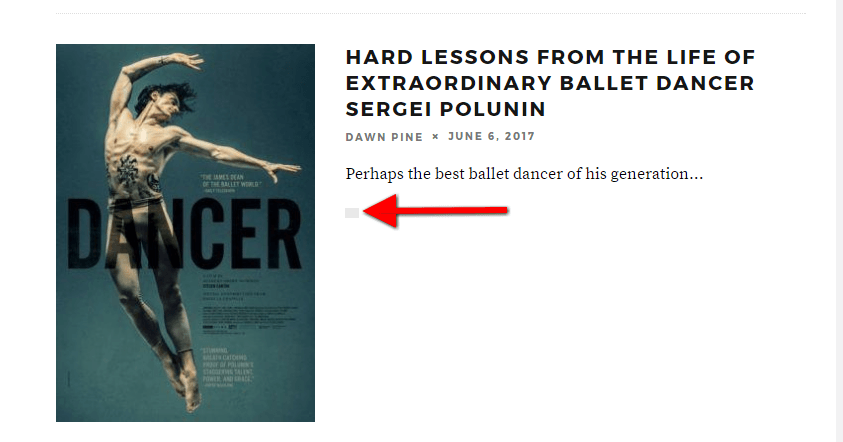
It’s been two and a half years since ROK had a re-design. I decided to go with a minor cosmetic update that is similar to the old design.
There are a few bugs we’re working on. The most urgent is the comment link showing up as an empty box on the main page and below each article’s headline (until that is fixed, click the box to be sent directly to the comments).
There may also be incompatibilities with the multitude of devices being used today. If you’re experiencing a problem, let us know so we can troubleshoot. You can also leave a comment below.
Read Next: 14 Essential Subjects That We’ll Teach Children At The ROK International School
Testing comments.
Testing reply. Hi Roosh
Testing replies to replies.
Works. “Yay” reaction delivered.
We’re not humans anymore…
testing replies to replies to replies to replies.
Hello, replies? …replies, can you hear me?
No replies, Jim. The signal might be jammed.
It’s dead, Jim.
check
Roger that!
Testes testes 1, 2…….1, 2
We have confirmation!
1…2……..THREE?!?!
You may need to get that checked out.
https://guideimg.alibaba.com/images/shop/2016/09/18/75/sexy-halloween-costumes-skimpy-outfits-nurse-costume-m-womens-u.s.-medium_26002675.jpeg
1… Wait-that’s literally Hitler.
Stop the oppression, numbers can choose to be nondecimal.
http://maddox.xmission.com/c.cgi?u=af17_sjw
All good except the article title not displaying in the article itself.
Can you share a screenshot?
https://uploads.disquscdn.com/images/b48980b6110d21bacdf4dcc03dc4150afe3133d6c60c8082b9fedc1ec454c663.png
Strange. What happens if you disabled adblock? If still the same, empty your cache and reload.
Yeah really strange. Disabling Adblock sorts it out.
I’m not sure why Adblock is counting the headline as an ad. There is no ad in that area.
I like it…it’s easy on the eyes, especially up top where it counts…
Me likey too
https://uploads.disquscdn.com/images/b5ee75bd091d4ff348495bb00a0c5981f6bed2987084b174f3a842d4c28fd744.jpg
I approve.
Love it!
So far I think it’s much better than the last design.
Beautiful! There is nothing I love more than change!
Except demographic change…
Nicely done
Nice re-design.
Looks good, Roosh! The only thing I’m a bit unsure about is the fonts. In the author bar, the letters of your name are spread a bit, and some of the text seems like it could be one pixel bigger (especially the “Prevous Article” bold text).
Can you post a screenshot so I know what you mean?
I think it’s a personal thing. The author name looks fine to me, now (I think the font threw me for a bit).
As to the “Previous/Next Article” text, the CSS at my end says “12px” while the text of the article is “18px”. It’s the same size as the text for the “Recent Posts” text, and it just comes a cross a bit small on my 1920×1080 screen. The Disqus content comes through at 15px, and that size is good on my monitor, so perhaps bringing the smaller font sizes up to 14 or 15 would make it seem a less-drastic size difference.
(You also might experiment with fonts in “em” sizes instead of “px”. “em” uses the default device text size, which might help when scaling to different screen sizes and browsers.)
First the original:
https://uploads.disquscdn.com/images/94a88a7e7d52fc304fca5af8a7aa2924e042982966e3b860205ca358b437a51b.png
Then with 15px set:
https://uploads.disquscdn.com/images/e7f8b8dce5cb5761650bfa1bbe3cf1c9fcc49f8840f757cfdf05fd8111be9d92.png
Finally, using 0.8em instead of a pixel size:
https://uploads.disquscdn.com/images/440d32fb7ee97586318401a890cab6e59b885a3bdd33031e745d1ac3ff1c8b17.png
UPDATE: Pulled it up on my phone without issues (comments loaded normally, site layout adjusted to the phone as expected). However, the 12px font is nigh-unreadable without zooming or getting closer to the screen. Normal text is fine, though, so I do think those few extra pixels would do the trick.
Although, I will say, it’s loading maybe twice as fast as it was yesterday. If I weren’t working contracts right now I probably wouldn’t notice as much, but it’s definitely faster. Props for that!
Thanks for the feedback. I will tinker with the design elements in the weeks to come.
I like the new look.
At first I thought there was something wrong with my computer. That was a couple hours ago. Glad you gave us this heads-up. Enjoy your weekend.
Looks good, and the primary picture for each article on the main page is now fit to scale, instead of smaller pictures having a lot of empty grey space.
It gets the RockOne stamp of approval!
Don’t like the re-design at all. Was hoping for more articles on feminism and [email protected]#xoxsos issues.
Not enough fat cake recipes too.
“I don’t always take money from suckers…but when I do, I bet on the NBA Finals.”
Man, that game last night was like taking lollipops from Kindergartners. Go Cavs.
Warriors to wrap it up in game 5, Uncle Bob?
Bet they go to 6. NBA stood to lose a whole lot of money with a 4 game sweep.
I think so also. It’ll be quasi competitive so as to defy skepticism but enough to ensure they get enough revenue.
I don’t know about that – I killed it on Game 4 and will wait to see if there is a Game 6…
Two thumbs up!
The advertisement panel is taking about 25% of the screen for me.
And the margins on both the left and right are quite wide. So lots of empty space. These things tend to cause the comments to have a “scrunched” appearance.
I use Firefox. Here is a screen shot.
https://uploads.disquscdn.com/images/15a89722053c0c56b3dd084b1bb100262dddb44e6ec89e7d848f44f554099fa0.jpg
It’s not using the full width? Can you try another browser to see if the problem remains?
Chrome is better. While the Ad window is still a little wider than before, the margins are much smaller.
I suppose your tech guy is targeting chrome. Very common these days, even with corporate intranet apps…
My instance of Pale Moon (a Firefox fork) is much better – instead of the disqus comment form being about the same size as the sidebar, it’s closer to a 2:1 ratio (much more palatable).
Just thought I’d mention that.
Thanks, never used it before.
I’ll check it out.
In my instance of Pale Moon, I had to zoom in the font size. Normally zoomed out, Pale Moon started at about 50% screen width used. It looks like the problem revolves around the page not tracking and using the full space available.
Tested this in Chrome, and results are the same. Zoom out to reduce the font size, and the webpage doesn’t track the available space properly.
It’s a friggin blessing on BB10. Good shit man.
Very slick design/template! How long did it take from design phase until you were ready to roll it out, just out of curiousity?
I used a template theme and customized it. It didn’t took long.
It’s fine — has a “flatter” graphical appearance and the comment text lines are wider (specs: running Firefox/Ghostery/AdBlock+ on WIN OS10).
When scrolling back up, though, I see an awkward “SITE LOGO” tag/designation on the static top banner that probably shouldn’t be there (when clicked, it goes to home page, so perhaps just mislabeled); it disappears only when you reach the very top and the actual ROK logo drops back into the banner.
Can you share a screenshot of where the “SITE LOGO” tag appears? I think you’re referring to the black menu bar that shows when you scroll up. The image should be a white ROK logo.
https://uploads.disquscdn.com/images/e77e333b940221abddd4e73105013643fa9ca51e525fbec1079a91fa0edebee8.jpg
The correct image is not loading for you. Can you try a different browser and see if it’s the same?
Looked fine on IE; might be my system. Thanks.
It could be a cache issue. Trying clearing it.
Browser update and a hard refresh (Ctrl + F5) cleared it. All good.
Looks good, Roosh.
Use https. We don’t need government and companies spying on us.
I highly doubt that would make any difference. Spies gunna spy.
The t-shirt is now outdated.
Nice re-design. Comments load slower than before, and so far don’t appear on my phone, which is windows mobile
Roosh, either you use Serif or Sans Serif fonts, but I would never mix both. Else, it looks good to me. Not a big radical change which is fine.
well it’s perfectly normal to mix serif and sans serif fonts as long as it’s done right. looks good here.
Sanserif is best for headlines, serif for body text. Looks good.
Hey, at least he didn’t use Comic Sans font!
Im a wing dings man myself
https://uploads.disquscdn.com/images/b83ca1e982ea3d4c395e7b3735e2a3ebdf97cffec5969efd639d895d8454e168.png
Remember how there was always that one person who turned in an essay or paper / writing project in Comic Sans?
Funny the things you remember! I never have forgotten seeing a woman do that. Bizarre.
The comments button from home screen for each article does not work, I just see a grey rectangle.
Comment text seems to be much smaller…
Where’s my microscope?
Can you post a screenshot?
I was viewing the site on an Ipad when I wrote that comment.
The culprit, I think, is the window on the right. It seems to take up about 25-30% of the screen, which forces Disqus to adopt a smaller font size. It’s not that bad, but it’s noticeable compared to the situation in the previous ROK theme.
It’s less of an issue in chrome, though (100% zoom).
Is anyone having issues with slow loading on mobile?
Nah. LG android NYC. I’m good here. Looks great.
Running Android on a Moto G4, loading just fine.
No problem on iOS.
Nice layout. Let’s test the images.
http://images4.fanpop.com/image/photos/15000000/George-Harrison-george-harrison-15032217-290-404.jpg
jpg images work good. Check. Now let’s test gifs
https://i.imgur.com/nxX7uLc.gif
Holy shit. Did I just uncover a conspiracy? Naah. I must lay off the kratom a bit.
I think you’re in too deep now…
The mobile version is a bit wonky. I have an android and uses chrome on my phone and the top banner doesn’t resize.
You mean the advertising banner right? It seems your device is requesting the desktop site. If you’re using Chrome, the settings menu has a “Request desktop” version option. Make sure it’s unchecked.
This is nice.
Thought I’d mention, on the front page I found one Disqus link that appears to be working as intended: https://uploads.disquscdn.com/images/5db8bcb2200415a51c9ed6c2ec609b5bfd121ee84c52be118f312d44e76193d0.png
Curious, indeed.
Yeah it is quite strange. Hopefully it’ll be fixed within a few days.
The site menu icon at top left of screen doesn’t list “home”. It used to list “home-about-culture-masculinity-store-advertize-donate-submit article”. This is on android chrome.
Now to return from an article to “home” I have to leave the site and go back to previous page or open new one from recently visited pages. Otherwise loads good. Can’t tell the difference.
Fixed.
Good job Roosh
Man, this new format is classy as shit. I need to buy a new blazer to read articles here now….
A nice double shot of scotch sitting beside a wood burning fireplace, in a red leather armchair. With a crow a tap, tap, tapping on your window..
By the beard of Zues! It looks great. I like the “wide screen” images on the main feed. Comments are also crisp and visible. ROK is looking very modern… and in no way is that depressing!
Images in the article list look nice but lower clicks to the articles. Increases cognitive load. Just text is better.
Of course, proof is in the pudding. Measure and compare.
Images in the article list also sucks up a boatload of space on mobile.
I LIKE!!!
Works better on my Android device. Articles load faster, more visually crisp, and Disqus loads much faster.
Simple but good design.
I hate all the paralex scrolling BS modern websites are transformed in.
Love it. Great refresh.
Look great on 4k but it would be better if you can see how many comments for each article!
We’re working on fixing that.
Looks nice and takes up less space – more efficient.
Except on mobile, where I’m finding that more space is used.
Nicely done Roosh…….nicely done indeed!
Not particularly mobile friendly.
On my device, on the main page, the preview for each article takes up an entire screen’s worth of space. With the old version, I could see multiple article previews per screen.
The trend in design is to be heavy on the images.
I would like to see the names, replies, and whatever I can click on in different colors so I can quickly pick out what is a link.
Looks nice. Am a tiny bit concerned after testing the other day that it overloads the capabilities of my very old mobile device and slow connection on said device. No problem of course on other devices, will continue to test on that device if I can still read ROK on public transport..
Have you considered a “Call to Action” section, where items that present an opportunity for action, such as commenting to regulators and policymakers on matters of interest to the RoK readership (e.g. via Regulations.gov in the U.S., and http://www.aph.gov.au/Parliamentary_Business/Committees/Submissions_Open in Australia) could be presented prominently?
There must be men in these agencies and legislative bodies who would welcome a public mandate to introduce some of our concerns into the legislative and regulatory process.
And as long as I’m here, there’s still time for readers who would like to comment on this matter (deadline Jun 12 2017, at 11:59 PM ET):
https://www.whitehouse.gov/reorganizing-the-executive-branch (originally found here: https://www.regulations.gov/document?D=OMB_FRDOC_0001-0201)
Roosh wrote the other day about bloated government departments, and their make-work jobs for women.
Nice format change. I don’t read this on a mobile phone so for me the rendering on the PC is quite elegant and efficient.
IMO it’s better to move the sidebar down and have a Wonkette-style format of three equal-sized featured article previews at the top. That way you have room to put more of your content feed above the fold.
Hey, nice … like your new look… What platform are you using?
The archives are down. http://www.returnofkings.com/archives By the way, is there a way to see a list of the most popular articles ever?
I like it – looks way better than one of the proposed versions shown a while ago. Nice job.